

Retro Poster Tutorial Using Photoshop
RETRO POSTER TUTORIAL
(INTERMEDIATE)
Using Photoshop

In this tutorial I will show you how to create a dynamic retro poster. I was inspired by a various number of night club posters and decided to create on myself. This is a pretty simple tutorial for users that are familiar with photoshop.
* Before you begin choose an image you would like to use. I used http://www.sxc.hu/ to find my image.
Step One:
Lets begin by opening a new photoshop document. I named this file Retro Poster, width 11 inches, height 17 inches, resolution 72, color mode RGB (mine is meant to be displayed on the web, for print use 300 resolution and CMYK color mode). BG transparent.
Before you do anything save this document. Throughout this tutorial you should save. I say this today because for the 100th time today I re-learnt the most valuable lesson there is don't wait till you have finished a clients logo that took an hour before you save when your on a tight deadline. Photoshop likes to crash!

Step Two:
Since we chose a transparent background we will have to give ourselves we will hae to create a background. Go to create new fill or adjustment layer Choose solid color. I used # ffffff. You can also use a light grey or even a subtle gradient. I feel white best suits this layout.

Step 3:
Open the image you saved at the beginning of this tutorial. Drag it into your Retro Poster document and name that layer Girl.
* make sure its above your color fill layer aka BG*


Step 4:
Now we need to make this image more dynamic so lets add some filters.
First I added a Brightness and Contrast Filter you can do this by going to create new fill or adjustment layer. I set the brightness to 108 and I set the Contrast to - 50.
Second I added a Black and White Filter you can also do this by going to create new fill or adjustment layer. I did this because I can better adjust how I would like the blacks and whites to appear. I set these to:
Reds: 300
Yellows: 300
Greens: -200
Cyans: 43
Blues: 40
Magentas: 70
Now our image is high in contrast and adds some depth. It also blends nicely with our white BG.


Step 5:
Now is time to give a nice layered look.
Duplicated the Girl layer two more times so in total you should have three Girl layers. Shift the layers by a few pixels, make sure the ones that are shifted are underneath. So it would appear that they are laid one on top of the other and spread out accordingly.
* The way the layers are set up and spread out is very important when it comes time to cropping the images

Step 6:
Now were going to crop our image.
I simply made a rectangle using the shape tool, rotated it according to which parts I wanted cut out and how. Once I have it positioned I CTRL Clicked the layer, then selected the girl layer in which I wanted to cut and pressed backspace. The I shifted the rectangle and followed these steps for each girl layer.
You can delete you rectangle after your done using it to delete the sections.
*There are a number of ways you can do this including using the the pen tool and selection tool but for me this way I get a straight line and I can position it exactly how I want it.

Your Girl images should look like this when they you are done.

Once you have achieved the above look merge all the girl layers together. You can do this by selecting all the girl layers right clicking them an selecting merge layers.
Next we want to add a more dynamic shape to this image. Get the pen tool and draw a shape that will curve the adjacent corners. when finished you should have to shapes. Go to your paths panel, right click the path, select make selection, another screen will appear asking the feather radius keep it at 0, press enter. Then select your merged girl layer and press backspace.

Once finished your girl layer should look like the below image

Step 7:
Now were going to add some retro shapes to make this poster more appealing.
Using the pen tool make a triangular shape on top of the girl layer. This time after you have made a selection, instead of pressing backspace, go to create new fill or adjustment layer. Select solid color. I chose # 000000 as my color of choice.

Then put the triangle layer underneath the girl layer and duplicate it.
Now this is where things may get a little tricky.
Put the duplicated layer on top of the girl layer, CTRL Click the triangle layer that is on top. Once there is a selection go to SELECT > MODIFY > CONTRACT choose 3 pixels then press enter.
* make sure your still on the triangle layer on top* Then press backspace.

Copy the steps above. Position the second triangle outline in a different direction and erase areas that you feel are appropriate, using the erase tool.
* Once finished your poster should look similar to the image below.

Step 8:
Get the pen tool and create a shape you feel is appropriate. for this poster. I decided to create a wispy black curl.
* follow step 7 to fill the shape with color.

Once you have the shape lower the layers opacity to 32%

Then copy that shape layer. Change the opacity back to 100%. Next go to FILTER > BLUR > MOTION BLUR.

Set the Blur Angle to 22 and the Blur Distance to 79

Step 9:
Lets add some Color now.
Using the rectangle tool create a series of thin lines. I chose # 0ab0f6 for my color of choice but you can use any color you want. Then merge all the rectangle into one layer.
Position this layer or the empty spaces in the triangle.

Once you have them positioned get the pen tool and trace out the inside of the empty space in the triangle. Make a selection, this time once you have a selection press CTRL SHIFT I, and pressbackspace. This will delete everything outside that outline.

Repeat the step above and your image should now look like the image below.
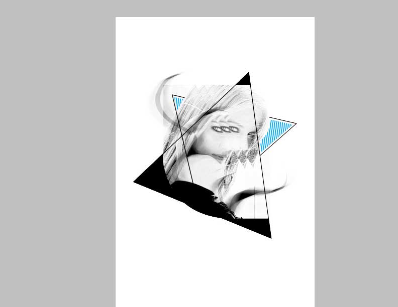
FINAL STEP:
Add some text around your image. Choose a thing typeface. I used Helvetica Ultra Thin. Add a splash of color to some of the text. Maybe even a shape with some motion blur and your well on your way to being a "Retro Night Club Poster Master"
The Finished Product
No comments:
Post a Comment