

Today I will be showing you how to take an image of a model and turn it into a futuristic composition that uses various Photoshop techniques. We will be doing some work with masks and implementing color and light effects to achieve the end result. If you are ready then start up Photoshop and let’s get started.
Final image
As always, this is the final image that we’ll be creating:

Resources for Tutorial:
Step 1
Open up the image of the dancer from the resources provided and what we are going to do first is clip out our model from the background. To isolate the model you can grab either the Pen Tool and trace or you can use a mask, which is what I prefer to do when long hair is involved! Take your time here and try to get a very precise selection going before applying your mask and removing the background as I have done here:


Step 2
Once you have clipped out the image of your model create a new 8.5” x 11” document and drag the dancer image into the document. Depending on the size of the image you are using you may have to resize it in order to fill out the canvas a bit. After scaling the image up and roughly centering the image we can now add a background. Create a new just below the dancer and fill it with a mid-gray color (I am using #818181).

Next, create another new layer above the solid gray layer and select a slightly darker shade (I am using #505050). With your Gradient Tool selected and set to a linear gradient fading from solid to transparent, drag from the bottom left corner towards the upper right to create a gradient. Once you have done that, change the Blending Mode to Multiply and also lower the opacity to about 72%.
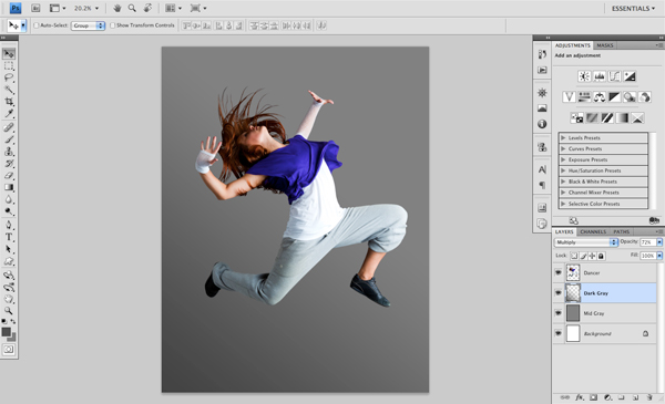
Create a third layer above the dark gradient layer and now select a light color (#DDDDDD) and create a linear gradient that goes from the upper right corner down to the center of the image. After that, change the Blending Mode of this layer to Screen and lower the opacity to 65%.

Step 3
The background could have a bit more contrast and be a little bit darker overall so I am just going to add a subtle Levels Adjustment Layer by clicking on the small icon at the bottom of the Layers Palette as shown here:

Once the histogram appears, move the left slider in so it’s set to ‘15’ and doing this will add some contrast to the background without having any effect on our model layer.

After applying this adjustment you should now have something like the image below:
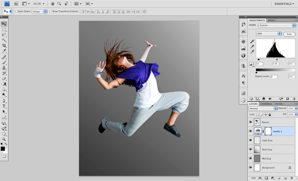
So far we have begun to set a mood and a distinct light source to the image that we can continue to build up using a variety of techniques.
Step 4
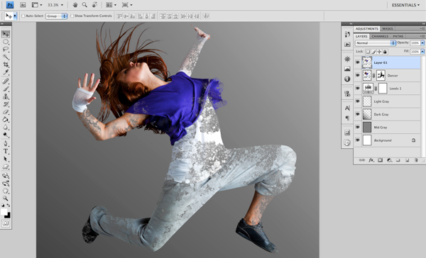
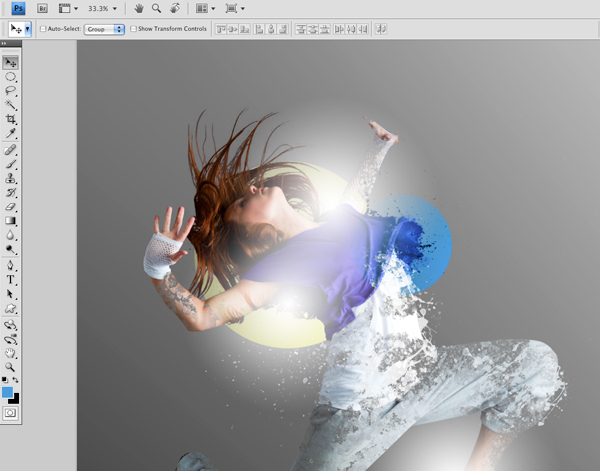
Add a new layer at the top of the Layers Palette and load up some of the splash brushes from the resources. On this new layer, with a solid white color selected, paint a splash onto the canvas. Feel free to transform the splash, rotate it, resize it, and position it somewhere on the lower leg as shown in the image below:

Hold down the Command Key and click on the splash once you are happy with its position. You should now have an active selection in the shape of the splash that we painted just a moment ago. Next, with the selection still active, select the layer with the dancer and press Command+J. You will now have a piece of the dancer contained inside of our splash shape, on its own layer just above the dancer.

To see what I am talking about, turn off or delete the original splash layer as we will no longer be need it. From here, turn off the visibility of the dancer and you should be left with the portion of the dancer inside of the shape as shown here:

Repeat this process a few more times using different splash brushes or something similar – any type of dynamic brush will work well for this and each can produce a unique end result. Again, turning off the visibility of the dancer will allow you to see the composite we are building up.

After doing this for a little while you will begin to see some interesting shapes and patterns. We want to place most of the splashes around the contours and appendages of the body. Once again, after turning off the visibility of the dancer image this is what I have:

Step 5
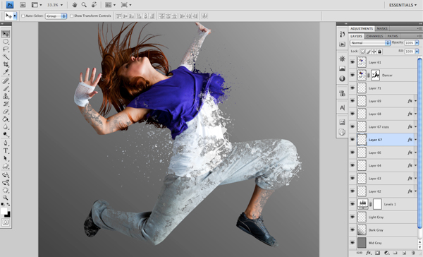
Next, we are going to add a Layer Mask to our dancer image so that we can remove parts of it to reveal the disintegrating effect that we created in the previous step. To do this, make sure you are on your dancer layer and select the Layer Mask icon at the bottom of the Layers Palette as indicated in the image below:

With a large, round brush selected, begin to paint with solid black onto the mask on the dancer layer. You can reduce the opacity of this layer a bit so that you can see what exactly you are removing from the original image. What I have done here is remove some of the image around the leg and torso as we have some interesting stuff happening there.

Repeat this process for other areas of the body by masking out the dancer layer. Lower the opacity as needed so you can see what areas to focus on. After spending a bit more time with this I now have this:
Step 6
For the next part, we are going to be using more of the splatter brushes (or splash brushes). Create a new layer, below the dancer image and sample some of the different colors from her clothing before painting with the brush. You may need to erase certain parts where you don’t want the splatter but it adds a nice effect:

Repeat this step a few times to add more splatters and position them where you think they will look best. This reinforces the idea that the model is disintegrating and that there are many small pieces kind of flying off as she moves.
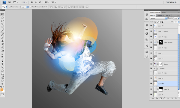
At this point I have quite a few layers so I am just going to clean things up a bit by selecting all of the splatter layers and pressing Command+G to put them into a folder. From here, I will do the same for all of the background layers at the bottom so that these will also be grouped into a folder.
Step 7
Create a new layer at the top of your layers palette and switch over to the Gradient Tool (B). Make sure that you have a solid white color and choose ‘Radial Gradient’ from the toolbar. Also, we are going to want it to fade from solid to transparent. Once you have done that, click and drag outwards from somewhere on the image and you should then have a white radial gradient. Duplicate ths layer two more times and place them roughly in the same areas you see below:

Next, on another new layer that we will be placing behind the dancer, create a large circle and fill it with a yellow-green color. Also change the Blending Mode to ‘Linear Dodge (Add)’.

Create another new layer, this one at the top of the Layers Palette and with your Marquee Tool (M) still selected, create a small-medium sized circle. Switch to your Gradient Tool (G) and create a gradient inside of the circle using a bright cyan color (I am using #3D9BDD). Change the Blending Mode of this layer to Color and position it towards the front arm and chest.
On another new layer we are going to use the same cyan color and just create a radial gradient that fades from cyan to transparent. Change the Blending Mode of this layer to Color and position it on top of the white gradient under the model’s back arm.

Step 8
Next, on a new layer, create another radial gradient using a slightly darker shade of cyan. Lower the opacity to about 80% and set the Blending Mode to Color before placing it near the model’s arm. Duplicate this layer and place the second gradient around the waist. Adding this subtle gradiation of blues will really help some of the colors jump out. The first image below shows the image with both of these gradients added, and just below that you will see how it looks without this color enhancement.


I have placed one additional yellow circle below the others and slightly off-centered to create a bit more visual interest in this area.

Step 9
Create another new layer at the top of the Layers Palette and using your solid to transparent radial gradient, select a vibrant orange color and make a gradient placing it near the model’s arm and head as shown below:

Play around with the size and positioning of the gradient to see how the colors blend together. This is a bit of an experimental stage so go with what seems to work best.
Below the model layer we are going to create a few more circular shapes in various sizes. I am using a vibrant orange color (#F9AB58) and placing the circles in different spots throughout the image. Continue to do this using various sizes and shades of either orange or blue at different opacities to gradually build up a nice effect.
After experimenting with this for a while and moving some of the shapes around I have come to an arrangement that I am quite happy with. The goal here is to just bring some balance into the design by trying to evenly disperse the colors.

Step 10
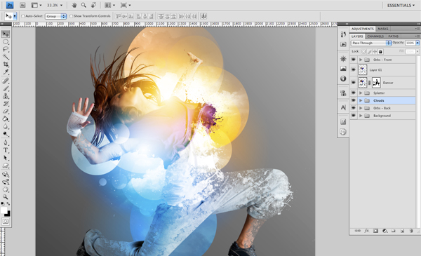
Load up the cloud brushes from the resources and on a new layer, paint a few different clouds onto the canvas. The main purpose of this is to add some texture and brightness to different areas of the image. I have masked a few of the clouds out so that they are only inside of the circle shapes as shown here:

After experimenting a bit more with the cloud brushes I have come to strike a balance that seems to be a nice addition to our design. The clouds are inherently ethereal and they add a quality to the piece that helps us to achieve a certain level of realness.
Step 11
At this point we are just going to brighten up the corner of the image. To do this, create a new layer below the dancer and create a large radial gradient fading from white to transparent. Change the Blending Mode to Overlay and position the gradient towards the upper right hand corner.

Step 12
Next, load up the Sparkle Brushes from the resources and brush in a few areas of stars and light streaks using a solid white color. Make sure to place this layer beneath the dancer layer and change the Blending Mode to Overlay.

After doing this we will darken up the outer edges of the image to really draw the eye into the focal point. In order to do this, simply place a new layer at the top of the background layers, below the dancer and all of the lights. Using your Gradient Tool (G) create a transparent to black radial gradient and lower the Opacity to about 65% and the Fill to 80%.

Step 13
Now we are going to add a bit of texture to our background. Open up one of the grunge paper textures from the resources and bring it into the document. You can also download this texture pack directly from this link. Press Command+Alt/Option+U and drag the Saturation slider all the way to the left to desaturate the texture. Next, change the Blending Mode to Multiply and lower the opacity to about 50%. Place this layer at the bottom of the Layers Palette, just above the solid gray background color as shown below:

Step 14
From here we are going to make a few small adjustments, and to do this we will use the Adjustment Layers at the bottom of the Layers Palette. Add a Levels Adjustment as well as a Brightness/Contrast to boost the overall contrast and brightness of our image.
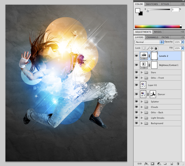
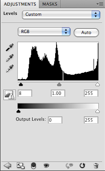
Below are the settings for both the Levels and Brightness/Contrast Adjustment Layers that have been added:

Step 15
At this point I am going to add a few final touches and add a title to the piece. I have also boosted the saturation slightly to enhance the richness of our image just a bit further. We can now save our work and enjoy the result! Thank you for following along and I hope you have learned a few new tricks along the way.
And We’re Done!
You can view the final outcome below. I hope that you enjoyed this tutorial and would love to hear your feedback on the techniques and outcome.
You can click on the image below to view the full-sized final piece:
If you’d like some more inspiration you can check out these awesome photoshop tutorials.

Tips of Graphics Design for Graphics Designer and Freelancer.
ReplyDelete